Monday, 21 March 2011
Thursday, 27 January 2011
Questionaire
1) What does the title suggest to you?
2) What genre/type of music does the magazine focus on and how do you know this?
3) What makes the pages look professional and what stops them from looking professional?
4) How genuine does the front cover seem?
5) Does the contents page simply inform or does it also manage to interest you in reading the rest of the magazine?
6) Does the article sound like a piece of journalism? If not what bits don't sound right?
7) Does the articles layout make you want to read it? If not why not?
From these questions I got 10 peoples feedback to review my coursework. From the feedback of my magazine title most people found the title got across the genre of my magazine straight away as the title is 'Volume' and this suggests a music genre immediately. The feedback showed people found the music genre existed throughout my magazine and from the title was clear as it mentions downloads and a battle of the bands. The feedback I got from my magazine looking professional was that the colour scheme and pictures looked genuine and the font use was eyecatching. The front cover seemed genuine for the same reasons and each caption I included was very realistic according to the people I gave the questionaire to for my feedback. The contents page seemed to inform but also interest the readers however didnt intrest one of the people I gave the questionaire to as she wasnt interested in girly pop music or r'n'b.
My Final Project

Front Cover
Overall I think my front cover turned out very well and I think it looks professional. I am happy with my colour scheme and font choices however I would have liked the background to my image of my character to have been whiter as I feel it would have stood out more. I am happy with the title of my magazine and the content which I have included in captions on the front cover.

I think my contents page looks very professional and the pictures stand out extremely well here. I like my font choice and colour scheme as I think the page numbers stand out well and it is not cramped so it would be boring to read.

I am most happy with my article page because I think the black and white photos go well with the black and white writing and I think the pink title makes it stand out. I also think the photos are displayed well and the content of my article fits my magazine genre perfectly.
Making my Magazine
I first began to make my front cover of my magazine and began selecting which photo I thought would suit my front cover best. I chose a semi close up view of 'Naomi Ashley', as I thought it fit the page well. I then began to use my selected fonts to produce my title and captions of what would be in Volume. I used barcodegenerator.com to make a barcode and applied my colour scheme well overall to make my front cover work.
I kept the same theme going throughout my magazine's front cover, contents and article.
For the contents I chose another picture of 'Naomi Ashley' as well as a picture of two other girls promoting an Rnb clothing range which was to be featured in my magazine. I then included what was featured in my magazine front cover in my contents and added extra information to create my contents page.
For my article two page spread, I first created my article and then applied it to an article template to get an idea of the amount of space it would take up. I then placed pictures into my article spread featuring Naomi and applied finishing touches to my article and the rest of my magazine.
Mock pages
Before making my magazine I created mock pages of each page on A4 paper to show the layout I originally want my magazine to full fill.
Monday, 13 December 2010
Planning
I have decided the name of my magazine will be Volume as I think from my ideas it is the most catchy and the one which makes the biggest statement.
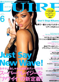
The person who will feature in my magazine is called Naomi Ashley. Her character is like Beyonce/Rihanna. My front cover will include either a close up shot of her face or a full length shot of her. I researched ideas for photos and the style of image Rihanna uses in photo shoots and magazine covers.


In the contents I will include pictures based on fashion and clothes which are popular on the high street today. I will also include make up and shots of my artist which link to my contents.
My article will be based on how Naomi's lower class background inspired her to be original and how her songs tell stories based on when she was growing up going from lower class to rich and famous. In my article I will include an introduction about Naomi Ashley and an interview involving her childhood and background compared to how she is now. I will include photos of when she was younger and how she is now using a camera and lighting to capture the images. I have not yet decided on any props however I am thinking of using some.
The person who will feature in my magazine is called Naomi Ashley. Her character is like Beyonce/Rihanna. My front cover will include either a close up shot of her face or a full length shot of her. I researched ideas for photos and the style of image Rihanna uses in photo shoots and magazine covers.
I like this image of Rihanna as it is simple to do however still looks strong. This would be easy to do for my magazine for Naomi on the cover.
This image is striking and the small amount of colour from the necklace and her nail varnish makes the image stand out more. I also like the colour scheme of her top matching the theme of the magazine. I will keep this in mind when I create my magazine.

This magazine is eye catching and could easily be done. I also think an image like this would fit well with the theme of my magazine as it isn't serious and would be appropriate for targeting my target audience.

This image works well with the colour scheme as it is put in black and white which works well with the blue background as it doesn't make it complicated and overpowering with colour but it still stands out. I like the idea of using a black and white image which I may try in my magazine article or on the front cover.
My article will be based on how Naomi's lower class background inspired her to be original and how her songs tell stories based on when she was growing up going from lower class to rich and famous. In my article I will include an introduction about Naomi Ashley and an interview involving her childhood and background compared to how she is now. I will include photos of when she was younger and how she is now using a camera and lighting to capture the images. I have not yet decided on any props however I am thinking of using some.
Thursday, 9 December 2010
Colour fonts

After I selected these fonts from www.dafont.com I applied colours to them to see which stood out most and to see if I still thought the same fonts stood out when I applied different colours to them. I have decided to use the font Billo or Abite for my main title and throughout my magazine contents and article for headings and titles. I decided although I liked the font 208 for my main article and other writing it would be too bold so I have now decided to use the sniglet font. From my colour tests I decided my colour scheme will be white with pastel colours but still bright enough to catch a readers attention. Colours such as the blue/purple used for (z) Arista, Billo and Cowboy hippie.
Subscribe to:
Posts (Atom)