Monday 13 December 2010

Planning

I have decided the name of my magazine will be Volume as I think from my ideas it is the most catchy and the one which makes the biggest statement.

The person who will feature in my magazine is called Naomi Ashley. Her character is like Beyonce/Rihanna. My front cover will include either a close up shot of her face or a full length shot of her. I researched ideas for photos and the style of image Rihanna uses in photo shoots and magazine covers.
I like this image of Rihanna as it is simple to do however still looks strong. This would be easy to do for my magazine for Naomi on the cover.

This image is striking and the small amount of colour from the necklace and her nail varnish makes the image stand out more. I also like the colour scheme of her top matching the theme of the magazine. I will keep this in mind when I create my magazine.

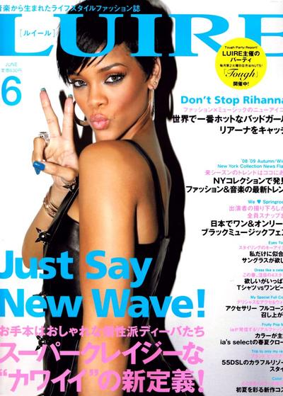
This magazine is eye catching and could easily be done. I also think an image like this would fit well with the theme of my magazine as it isn't serious and would be appropriate for targeting my target audience.

This image works well with the colour scheme as it is put in black and white which works well with the blue background as it doesn't make it complicated and overpowering with colour but it still stands out. I like the idea of using a black and white image which I may try in my magazine article or on the front cover.

In the contents I will include pictures based on fashion and clothes which are popular on the high street today. I will also include make up and shots of my artist which link to my contents.

My article will be based on how Naomi's lower class background inspired her to be original and how her songs tell stories based on when she was growing up going from lower class to rich and famous. In my article I will include an introduction about Naomi Ashley and an interview involving her childhood and background compared to how she is now. I will include photos of when she was younger and how she is now using a camera and lighting to capture the images. I have not yet decided on any props however I am thinking of using some.

Thursday 9 December 2010

Colour fonts

After I selected these fonts from www.dafont.com I applied colours to them to see which stood out most and to see if I still thought the same fonts stood out when I applied different colours to them. I have decided to use the font Billo or Abite for my main title and throughout my magazine contents and article for headings and titles. I decided although I liked the font 208 for my main article and other writing it would be too bold so I have now decided to use the sniglet font. From my colour tests I decided my colour scheme will be white with pastel colours but still bright enough to catch a readers attention. Colours such as the blue/purple used for (z) Arista, Billo and Cowboy hippie.

Fashion and font mood boards

My last mood board was quite vague at looking at different fonts appropriate for my magazine so I did another developing my choices further at looking at a wider variety of fonts which I downloaded from dafont.com. From this mood board the ones which I think stand out most and are my favourite are Billo, Abite and 208.
After my first mood board which was on magazine covers, album covers and images of celebrities, I decided to make another focusing on fonts used on album covers based around the genres of my magazine pop and rnb. I also inserted three fonts which I liked and thought would be appropriate as they are similar to the fonts used on the album covers. In this mood board I have also used some elements of fashion which celebrities wear and other fashion pieces which are available in some of the top highstreet shops such as Topshop and Rare.

Wednesday 8 December 2010

Circulation Figures

I researched circulation figures to see which kind of magazines have the highest demand in the market and which kind targets the same kind of audience my magazine will. I used http://dezji.wordpress.com/2010/08/19/july-2010-music-magazine-circulation-figures/ to get the following music magazine circulation figures:


Classic Rock 70,323 (Dec 2009: 71,242, Jul 2009: 70,310) 12 month change +0.0%
Kerrang! 44,013 (Dec 2009: 41,125, Jul 2009: 43,253) 12 month change +1.8%
Metal Hammer 44,034 (Dec 2009: 41,777, Jul 2009: 46,004) 12 month change -4.3%
Mojo 91,678 (Dec 2009: 98,484, Jul 2009: 97,722) 12 month change -6.2%
NME 33,875 (Dec 2009: 38,846, Jul 2009: 40,984) 12 month change -17.3%
89,450 (Dec 2009: 94,811, Jul 2009: 100,172) 12 month change -10.7%
Uncut 74,067 (Dec 2009: 75,518, Jul 2009: 76,526) 12 month change -3.2%
The circulation figures for Q magazine helped me the most with my research as this magazine is the most alike to the one I will produce and the circulation figures show this kind of magazine sells.

Wednesday 1 December 2010

Moodboard

Here I produced a picture mood board using photoshop where I used colourful existing magazine covers, album covers and photos which featured popular celebrities which look similar to the one I will create to get an idea of the kind of image which appeals to teenage girls and the style and image which are popular in the current music charts. I also featured artists which are of a similar music category to the music artist I will feature in my magazine following the pop/r'n'b genre.

Institution to produce my magazine


For my magazine institution choice, I chose Emap. Emap is a media group which operates with many different sectors such as the media and fashion sectors. I have chosen this institution to distribute my magazine as they cover both these music and fashion sectors which fits my magazine genres. They provide information and analysis around different sectors and develop a programme to distribute a product. Emap markets and offers information to companies of how they can take advantage of the market. They offer news on how the market is changing both in the UK and throughout the world and this is clear research from them which would benefit a magazine such as mine.
home.jpg

Thursday 25 November 2010

Development questionnaire

1. Are you Male or Female? (tick)
Male 8
Female 2

2. How old are you?
10-15......
16-25 10
26+......

3. What is your favourite genre of music?
Pop 4
RnB 4
Indie 2
Rock......
Other......

4. What draws you into buying a magazine?
Pictures of Celebrities 3
Competitions......
Interviews 3
Articles 4

5. How often do you buy music magazines?
Often.....
Now and Again 2
Hardly Ever 6
Never 2

6. How much would you pay for a magazine?
£1.00-£2.50 6
£2.50-£4.00 4
£4.00+......
Never......

To help develop my research I made a questionnaire which would inform me what appealed most to different people. I asked more females than males to fill out my questionnaire to get information of the kind of magazines females prefer. All the people I asked were in the age range 16-25 as that is my target audience age. From asking which is the preferred genre of music from the people I interviewed I found Pop and Rnb are the most popular which has helped me with the content of my magazine particularly with choosing the people I will have pictured on the cover, contents and article. Articles was the most popular choice which would draw people into buying a magazine as well as interviews and pictures being eye catching. The last two questions showed more people hardly ever buy music magazines and that they would pay under £4.00 for a magazine.

Music Charts Research


  1. Whip My Hair
    Willow
    Whip My Hair
  2. The Time (Dirty Bit)
    The Black Eyed Peas
  3. Your Song
    Ellie Goulding
  4. Only Girl (In the World)
    Rihanna
  5. Like a G6 (feat. The Cataracs & Dev)
    Far East Movement
  6. Who's That Chick? (feat. Rihanna)
    David Guetta & Rihanna
  7. Poison
    Nicole Scherzinger
  8. What's My Name?
    Rihanna & Drake
  9. Thinking of Me
    Olly Murs
  10. Christmas Lights
    Coldplay
Willow Smith is currently number one in the ITunes UK top 10  with the Black Eyed peas following with a remix of the Dirty Dancing song The Time, these appeal to both male and females of different ages however fit into my genre and target audience for my magazine. This helps with my research as it shows my target audience and genre choice fits into the media at the moment. The X Factor finalists are currently number one in the Radio One Uk top 40 which tells me programmes such as the X Factor are very popular and appeal to the public too. JLS are currently at the number three spot in Radio 1's UK top 40 charts and are a british pop band which came second in X Factor 2009. They appeal mainly to teenage girls which makes them appropriate research for my music magazine.
There are also other music artists in the top 10 which appeal to my target audience such as Rihanna, Katy Perry and Ellie Goulding which I will research to find out their style to adjust their images to apply it to my magazine in a unique way.

Unique Selling Point

My magazines aim is to attract the 16-30 age group because mainly girls and from my research I have found the main uses to make a magazine stand out are bold fonts and the use of colours and pictures.

I have also been thinking of names for my music magazine appropriate to the style and genre of magazine and target audience. So far I have thought of ;
Volume : I think this would be appropriate because it instantly lets the reader know it is a magazine based on music whereas for example the existing magazine name ''More'' isn't as clear on the contents and style of the magazine without looking further.
Dance : I think this would capture the age range my magazine is targeting particularly outgoing people who are into the latest music in the genres of pop/r'n'b etc. Like the previous name idea Dance would again let the reader know it is a magazine of a music genre.
Loud : This magazine would be appropriate for a music magazine because again it is relevant to music and the genres because the music is upbeat and would be dance music.
Move : This is again to do with music and dancing which would suit my target audience for my magazine, I also think the sharpness of the word move would be a good name for a magazine as it is powerful and snappy.


Thursday 18 November 2010

Preliminary Task

Front Page
To help me with my training I did a preliminary task on a magazine for St Marys College. To do this I took a picture of my friend and cropped round the image in photoshop. I then placed the image into indesign and inserted a barcode, title, three sub headings and an advert for a competition. I also used bright colours to make my magazine stand out and used them appropriately for my teenage target audience. I think my front cover follows the conventions of a normal magazine but next time I would insert more images into my magazine cover because from my questionnaire I found images are one of the sectors which capture the readers attention as well as interviews. I would also use a better colour scheme and better fonts as I think the ones I have used are boring and fonts can often be the main feature which catches a readers attention. 

Contents Page
To develop my preliminary task I drew out a contents page which included a magazine title, contents of what each page of the magazine will include and pictures down each side relevent to the contents of my magazine. When I create my real contents page there will be images which stand out using bright colours and they will be statement images such as an album cover like Rihanna's ''Rehab'' as it stands out through colour and the type of font however it is still a simple design.

Thursday 11 November 2010

Magazine Training

Using the programme InDesign I created the magazine front cover above for my magazine training. By following a booklet with instructions, I learnt how to insert an image, use colour/fonts and size to make writing stand out as well as inserting a barcode and the use of layout for a font cover. I now know more about the tools InDesign has which will help me create my magazine when I have finished my planning.

Monday 8 November 2010

Music Magazine Analysis!

The magazine above has a short, sharp and bold pink title which would grab a readers attention and the pink colour theme would mainly target girls. To the top right hand corner is a competition advert which would attract readers to the prize as well as the main front page focus being on Keyshia Cole and as she is famous it would interest readers to want to read the article inside. Elsewhere on the page are famous singers mentioned and smaller photos of celebrities to expand the target audience as not everybody likes every artist. For example to the bottom left, Britney Spears, Usher, Akon etc are listed showing they are featured within the magazine.


The contents page above for vogue indicates it is a fashion magazine because of the model on the left. The bold vogue writing at the top, like any front cover, makes a statement and the colours used are simple and neutral which targets women. Vogue is a magazine which targets young women around 18+ and the font and pale neutral colours reflect sophistication which would usually attract this audience. The two headings ''Fashion'' and ''Special Features'' are bolder than the rest of the writing which makes them stand out but it doesn't cancel out the sophistication the magazine holds. Although I think this contents page is perfect for the target audience Vogue has, for my magazine I would make it much brighter and bolder with more pictures because I think many younger teenagers would find this type of layout boring.


The article above is an article from a woman's magazine. Using a purple strip behind the title it makes the title of the story stand out by working with the bold white top line ''MY MAN WEARS'' followed by the next line ''girls clothes'' which is in black. The use of purple behind both black and white makes both parts of the title stand out and the different fonts reflect men and women going from bold to a feminine font. The picture of the man on the page dressed up both normally and another in girls clothes grabs the reader as he looks like an ordinary man and within the article are bolder sub headings which stand out important to the rest of the article.

Using this magazine analysis I can develop my ideas to target the same type of audience 'Beat' attracts and use a similar style to promote mine in the same way. In my magazine I will include bold fonts and bright colours to make it stand out as well as photos of young women to capture my target audience as teenage girls are mainly interested in new fashion and music. From this magazine analysis I decided from the music magazine cover of Beat that my initial idea of having a music magazine and then creating a genre hybrid to mix it with fashion it was a good idea as Beat does this exactly.

Initial Ideas and Target Audience

I have decided to make a magazine for my coursework based on a pop music genre following a girl band or solo singer. My singer(s) will be similar to stars such as Cheryl Cole, Amy Winehouse or Fergie or bands such as Girls Aloud, The Saturdays or The Sugababes. I would like my magazine to be a music magazine which includes some elements of fashion however this will limit my target audience to mainly girls as my singers would be the style icons I would fix my magazine on eliminating the appeal of my magazine for boys. Although doing this may make my magazine target audience widen for girls as some girls would prefer fashion over music and others would prefer music over fashion, this makes my magazine appropriate to suit both preferences. I want my magazine to focus on pop/r'n'b genre of music and the fashion be based around this genre too which would be fairly girly and quirky clothing with heavy jewellery.

My magazine will include a front page with adverts, images and magazine title as well as a contents page and double spread interview or article on my chosen celebrity.


The genre of my magazine is pop music which will be mainly aimed to be appealing to teenage girls around 16+ to an age of around 25. I have chosen girls in this age range because I think they are the most likely to spend money on music and fashion magazines particularly because they like to follow celebrities and the music charts and keep up to date with the changing media. I think women follow the media a lot more than men however this isnt always the case and this age range is when women are working so they have money to spend on extras such as magazines and it is also in this age range where they are most interested in looking their best. To make sure my magazine appeals to this category I will need to research what appeals to girls of this age by looking at different magazines available and what they use to draw in readers. To help me identify my target audience I am going to use
Gender which would be female mostly
Race would be any
Age which would be 16-25
Social economic status which would be middle class

I will analyse different magazine covers, content pages and articles and see the layouts and fonts which they use to target this target audience.